

Wellness Spa Branding
Solena Spa
Luxury wellness that rejuvenates the body and calm the mind. Created for middle-aged women seeking elevated self-care.


The Problem
Although Solena offered premium treatments at premium pricing, the brand felt overly clinical and sterile. The visual identity didn’t reflect the warmth and sensory luxury of the in-person experience.
For women investing in high-end wellness, the brand must feel like an escape — not a medical office. The disconnect made the pricing feel unjustified, even though the services were exceptional.
The Strategy
The goal was to reposition Solena from clinical to sanctuary.
The brand was built around three core emotional pillars:
• Warmth
• Stillness
• Sensory harmony
Rather than highlighting treatments first, the messaging centers on how women feel when they leave — restored, radiant, grounded.
The name itself anchors the identity.
“Sol” symbolizes warmth and glow.
“Lena” softens it — bringing femininity, calm, and it’s the name of the CEO.
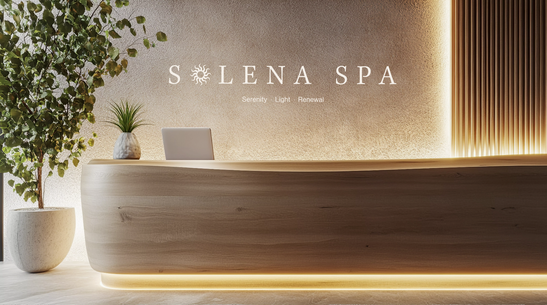
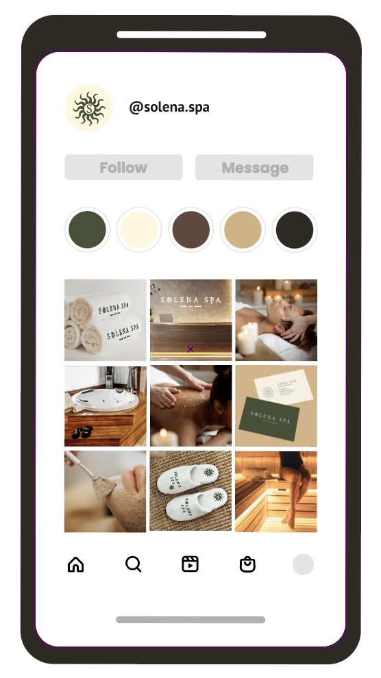
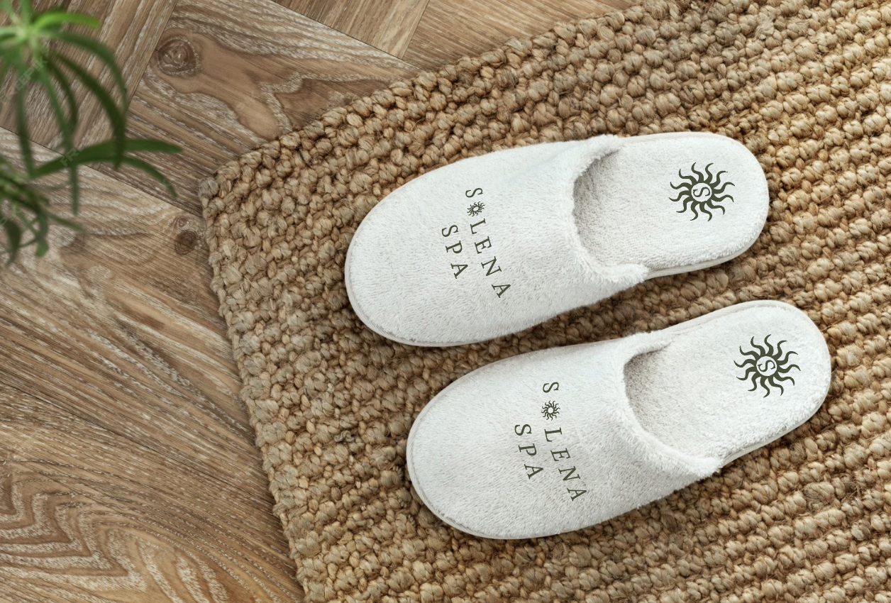
The Visual Direction
An earthy palette was chosen to create calmness. These tones move away from harsh clinical whites and medical blues, reinforcing emotional warmth and relaxation. Rounded shapes and soft spacing create flow and ease, while elegant serif typography introduces quiet luxury.
The overall aesthetic feels like golden-hour light — warm, calm, and enveloping.
The Outcome
Solena now visually matches its pricing and experience.
The brand communicates luxury before a client ever books — building trust, desire, and perceived value through intentional design. Because in high-end wellness, the atmosphere begins long before the appointment.