
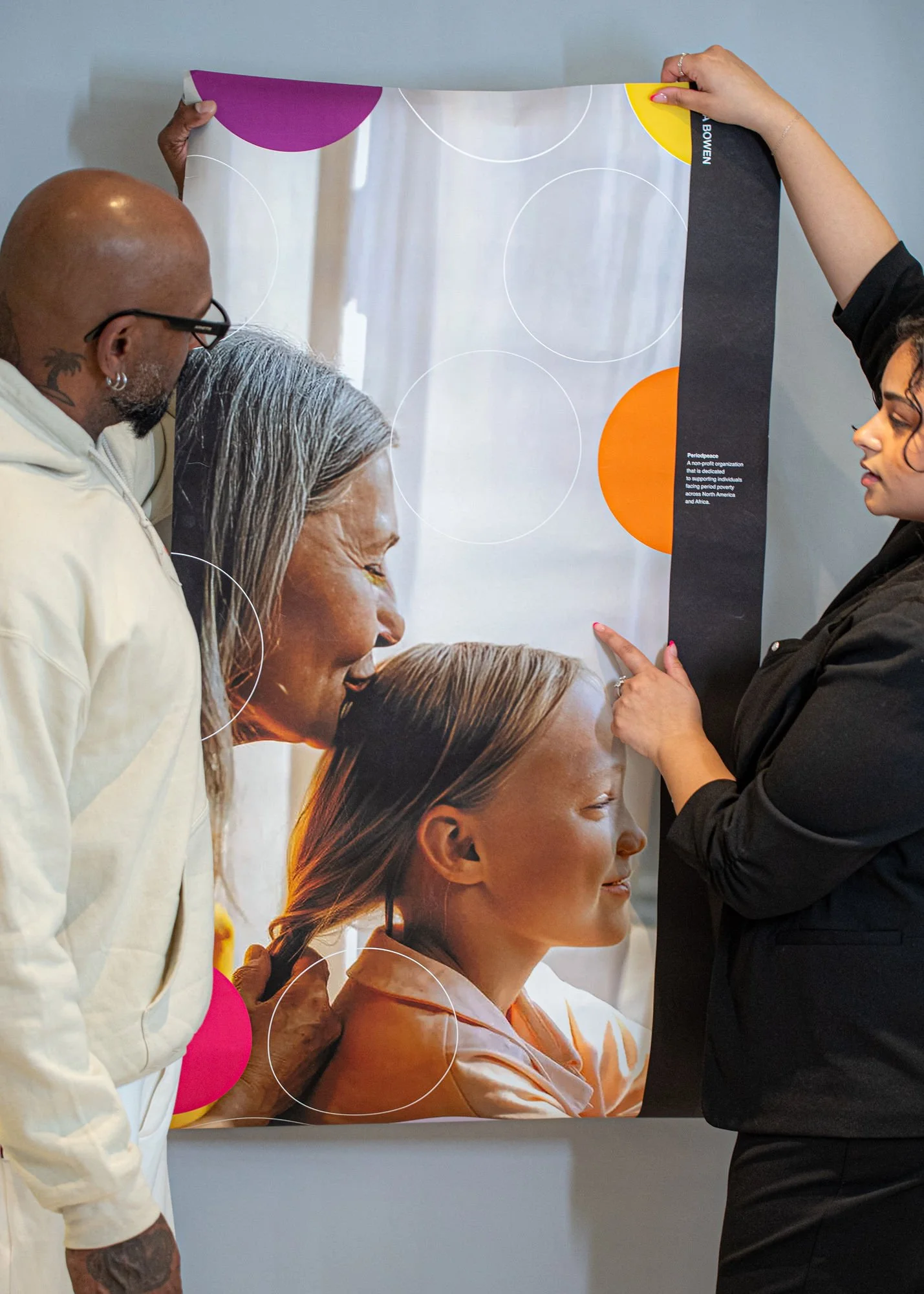
Non-Profit for Period Poverty
Period Peace
Organization created to combat period poverty across North America and Africa. Every woman deserves access to menstrual products without shame, embarrassment, or financial stress.


The Problem
Period poverty remains a global issue. Across North America, period products are expensive — forcing many women and young girls to choose between food and basic hygiene. In some cases, paper towels or makeshift alternatives are used out of necessity.
In parts of Africa, access is even more limited. Many girls rely on unsafe materials such as leaves or banana peels, leading to health risks and school absences.
Period Peace was designed to remove the stigma and provide consistent access through:
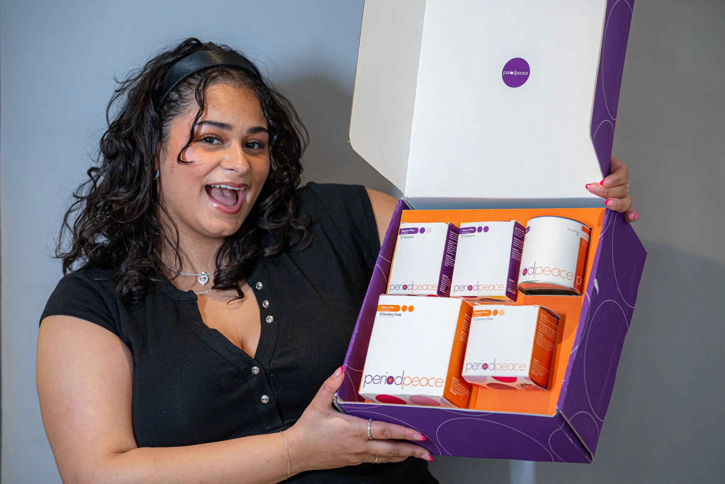
• Monthly free hygiene kits
• School distribution programs
• Public access points in community spaces
The Brand Strategy
The brand needed to feel:
• Empowering — not pity-driven
• Approachable — not clinical
• Bold — not quiet or apologetic
• Trustworthy — as a donation-based non-profit
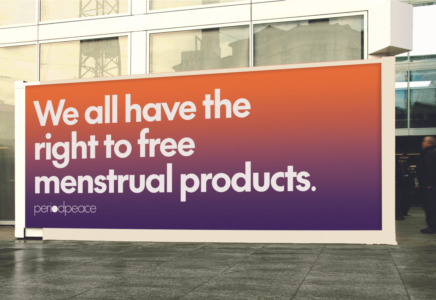
I made sure not to lean into traditional “feminine” branding; the strategy focused on visibility and confidence. This organization is not whispering. It’s advocating.
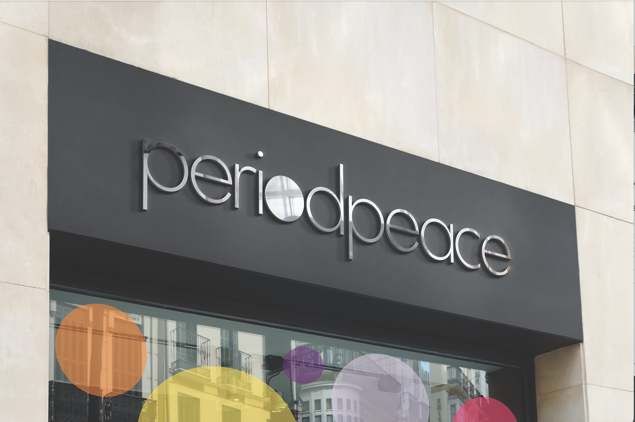
The Visual Direction
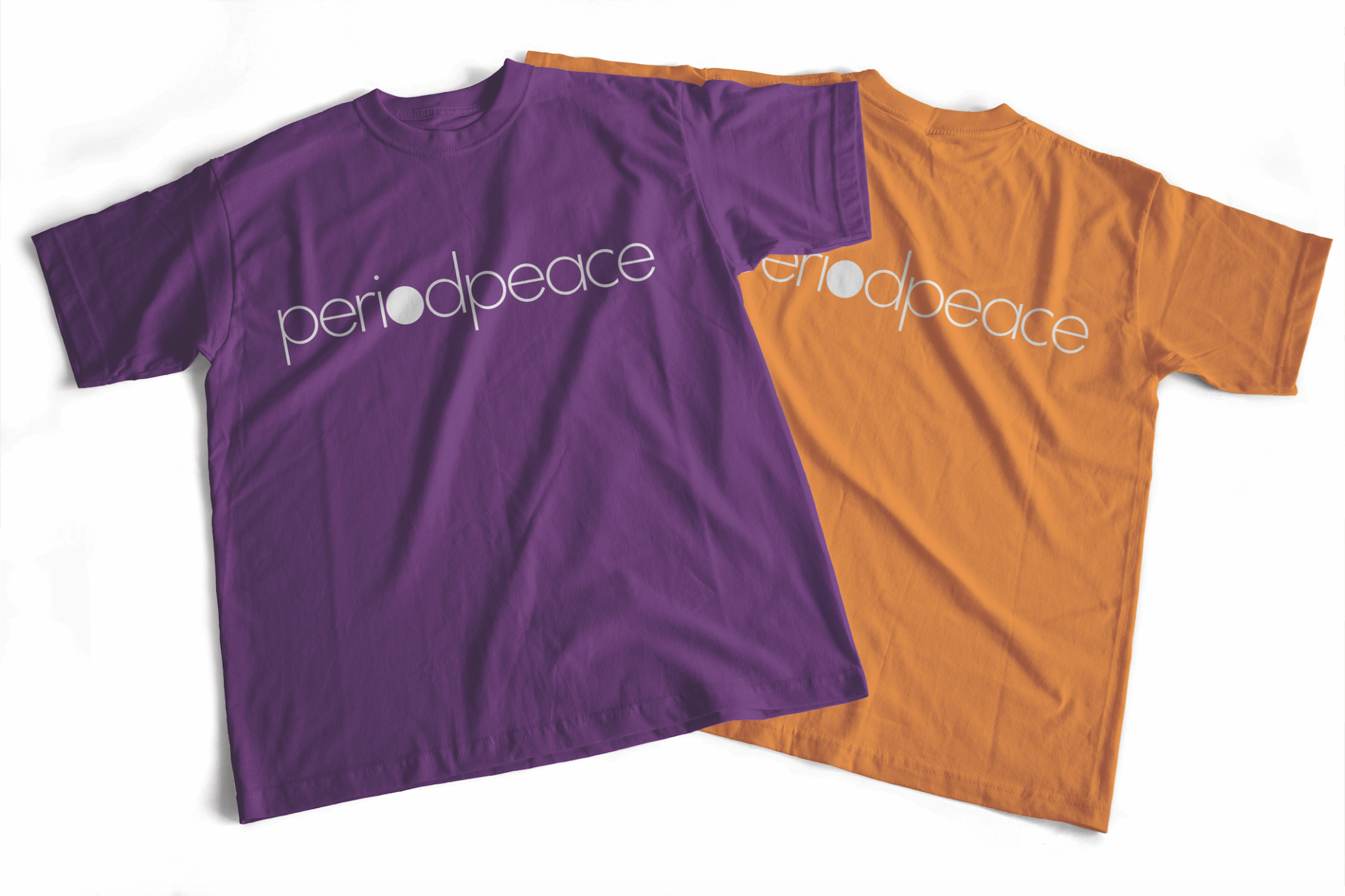
Purple and orange were intentionally chosen to stand out in an industry often dominated by muted pinks and sterile medical blues.
• Purple represents dignity, empowerment, and strength.
• Orange adds warmth, optimism, and approachability.
The circular design elements reinforce inclusivity, community, and safety — visually symbolizing protection and unity. The overall aesthetic balances bold advocacy with friendliness, ensuring the brand feels welcoming while still powerful.
The Outcome
Period Peace positions itself as a movement — not just a charity.
The brand system allows for strong awareness campaigns, community partnerships, and donor trust, while maintaining a warm and human presence.