

Women’s Country Club
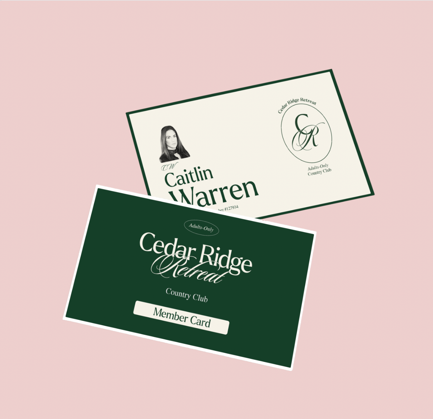
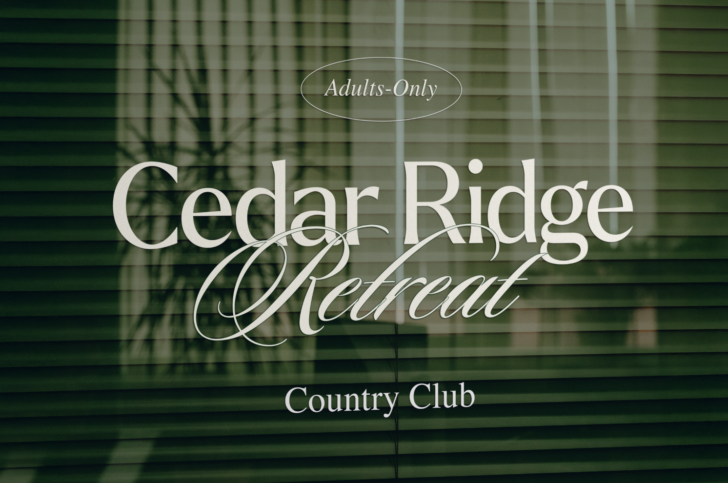
Cedar Ridge Retreat
Upscale, adults-only country club for women who love golf, connection, and community.

The Problem
Traditional country clubs have long been shaped around male culture — from branding to atmosphere to networking structures. While many women enjoy golf, they often enter spaces that don’t feel fully designed for them.
Cedar Ridge Retreat was created to change that.
As a brand-new club entering a legacy-driven industry, it needed to:
• Establish authority
• Feel premium
• Stand out visually from traditional, conservative clubs
• Attract confident, established women seeking both sport and sisterhood
The Strategy
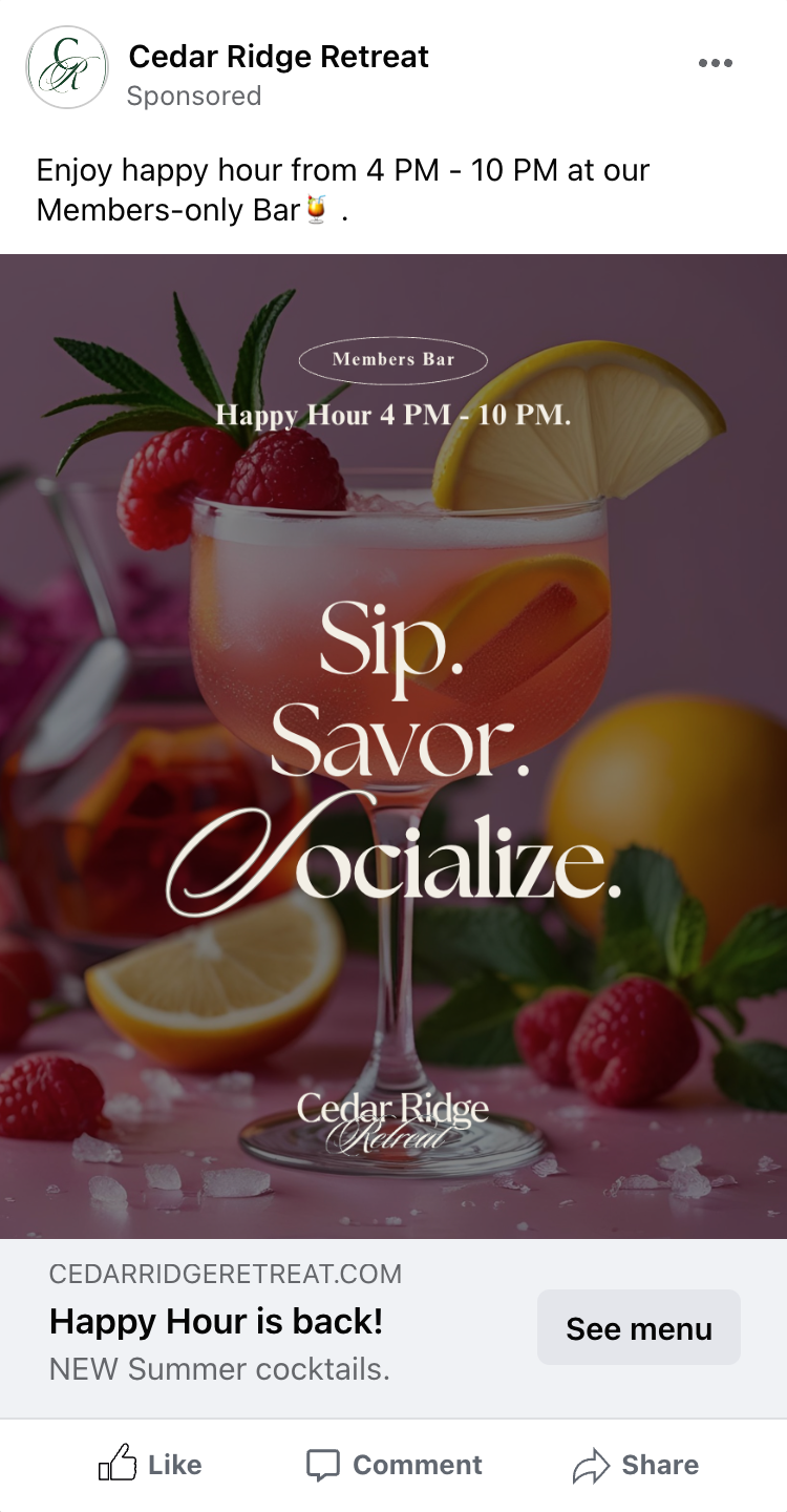
The brand was positioned around empowerment, refinement, and community. This isn’t a “cute girls golf club.” It’s a powerful, exclusive space where women gather, lead, and belong.
The tone balances sophistication with warmth — ensuring it feels high-end without being cold or intimidating.
Community was central to the strategy. The club isn’t just about golf — it’s about connection, mentorship, and shared success among women in similar life stages.
The Visual Direction
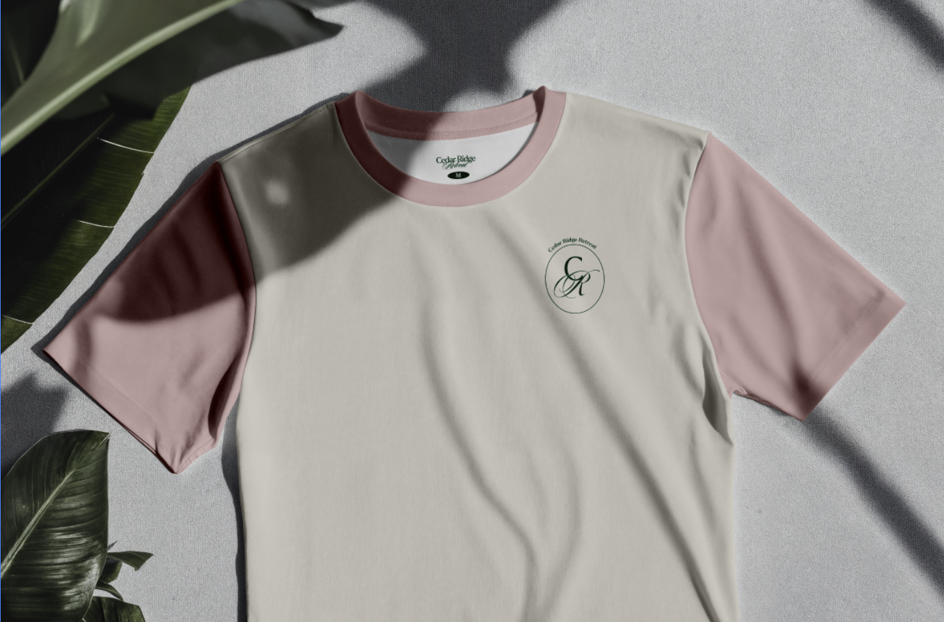
Pink was intentionally chosen to reclaim and elevate femininity — not in a soft or delicate way, but in a confident and modern way. Green anchors the identity in the golf tradition, symbolizing growth and legacy.
The Outcome
Cedar Ridge Retreat enters the market not as an alternative, but as a statement. The identity clearly communicates who the space is for and who it is not.
It positions the club as a destination for empowered women seeking both luxury and belonging… on and off the course.